Ever since I traveled outside of Egypt for the first time in 2012 when I was 15 years old (I want to France with my parents), I’ve been absolutely obsessed with collecting snow globes from each country I visit. This soon developed into asking friends and family to bring back snow globes from exotic, faraway places that they visit as well.
Over the years, my collection has steadily grown and I now have snow globes from more than 20 countries! I really enjoy collecting them and visiting new places, it’s especially heartwarming to me when a snow globe is linked to a fond personal memory, or is a gift from someone I love.
Below is a slideshow of each of my snow globes. Some have taken damage or broke either from transporting them home or because of various accidents over the years, but I never throw them out because each snow globe is precious to me and I still find them beautiful! I hope you enjoy my collection and keep looking back as I update it regularly.
One of my fondest hobbies is building Lego sets! I especially love more realistic sets of cities and landmarks.
Because I’m very detail-oriented and love busier pieces with lots of tiny details, I’ve tended to stick to the City collection (with a few exceptions) since the buildings open up and have so many rooms and floors inside them, which I find so pleasing to make and look back on!
Below you’ll find the Legos I’ve completed so far, for each one I provide a link to the set (showing the name and the number of pieces), and photos of the completed work.
I hope you enjoy these sets and this inspires you to build some of your own! Keep checking back as I’ll keep this page updated regularly every time I build a new set.
This is by far the pride of my collection. Not only is it the largest set, but it also has so many little details and references to various Disney movies. It’s taken some damage over the years and I’ve had to rebuild some parts so it looks a bit different from the original, but I had so much fun building it and it’s really a beauty to look at.
I’ve highlighted some of the fun references to Disney movies, namely Cinderella’s glass slippers, Sleeping Beauty’s Sewing Wheel, a fairytale book, Beauty & The Beast’s rose in a jar and candlestick, veggies and kitchen stuff from Ratatouille, and the wizard’s hat and broomstick from Fantasia.
Here you can also see the poisoned apple and magic mirror from Snow White and the bed from Sleeping Beauty.Continue reading “Lego Mania!”
This project started as my MSc thesis and I have continued to work on it ever since with my previous thesis supervisors Dr. Uta Hinrichs and Dr. Loraine Clarke (St Andrews University), as well as Dr. Stefania Forlini (University of Calgary).
Using the interface to filter a pile of books for ones that have blue or red covers.
TL;DR
An extensive review was conducted, leading to the identification of two main weaknesses in existing literary collection browsing interfaces: the focus on content at the expense of physical properties, and the onerous nested, keyword-dependent search mechanisms. Several solutions for overcoming these issues were explored, and multiple existing works employing them were reviewed.
Based upon the insights gained, several alternative designs were created in various fidelity levels to explore possible interfaces that could offer a novel browsing experience.
After adapting, combining, and eliminating some designs, the emerging ones were fashioned into an interactive prototype using Axure RP 9 in HTML, JavaScript & CSS. The prototype also incorporated several overview-giving filters oriented around the physical and material aspects of the collection. It additionally employed a natural language, auto-complete-based search bar supplemented visually with anthology snippets.
The prototype was evaluated through a pilot study where participants found it engaging and pleasant, especially appreciating the variety of perspectives offered by the alternative layouts and the comprehensiveness and novelty of the filters.
This project saw me create my own website to showcase my portfolio and act as an interactive CV.
The website was coded in JavaScript, HTML, and SCSS and it makes use of Bootstrap, Node.js, and React. The back-end consists of a NoSQL Firebase database and a Firestore storage management system.
The website has the following sections:
An “about” section where I display my skills categorized by disciplines and a short bio, as well as a downloadable copy of my CV.
A “publications & presentations” section which is populated dynamically through the mentioned Firebase database and storage management system, and redirects to ‘hub’ pages linking to all the relevant resources available.
A “projects” section that is also populated through the same Firebase database and which redirects to various blog posts I’ve written describing the projects and the processes undertaken during their development. These also include links to view videos or download applications depending on the nature of the project.
An “experience” section that consists of a timeline animated through React and showing my past work experience.
A “programming languages” section that shows the languages I am familiar with and have coded projects in, each redirecting to a filtered view of my Github repositories that are in the selected language.
A contact form that allows people to reach out to me via email.
The whole website is made up of a single page, with each section residing in a seperate JavaScript file, as well as any major components of the interface such as the tiles used for the publications, talks, projects, and languages, the timeline, the overhead navigation bar, and so on.
Below are some screenshots of the various sections of the website, and you can also see a scroll-through in the video at the top of this page.
I’ve always been very interested in designing hardware beyond the screen, as well every day objects like furniture and toys.
My only product design project so far has been to come up with four Kendama designs for a competition where the winner will have their design manufactured and sold.
If you don’t know what a Kendama is, you’re not alone, I only got into this because my boyfriend is obsessed with them, but you can find out more here: https://kendamausa.com/about/
I made all the designs using Adobe Illustrator and you can see them below:
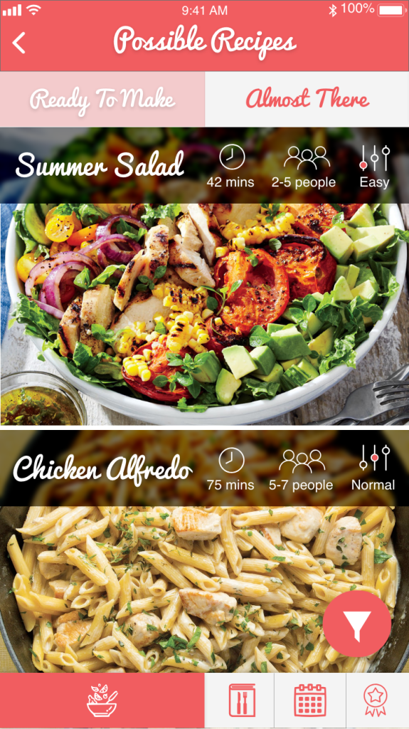
The idea behind this application was to cater to busy, stay-at-home moms who might need to make last minute meals with the food they have available. Instead of browsing by recipes and then buying the needed ingredients, instead the app allows you to search for recipes using the ingredients you have available. The persona created for this app was as follows:
The envisioned sitemap for the application looked like this:
The structure of the app was meant to be comprehensive (features such as ‘recipe of the day’ were added in order to allow other personas to use it as well), yet very intuitive and simple to use (to make it friendlier for older users who might not be super tech-savvy). Below you can find screenshots of mockups for the different screens created for the app. An interactive prototype was also created to explore animations and transitions between pages.
Orange Telecom Mobile Website:
The following is a redesign for the existing Orange website, which can be seen here: https://www.orange.eg/en/
The redesign was meant to have a more modern, sleeker look to cater to younger clients, and to also group items intuitively to make the overall experience more streamlined and enjoyable.
Universities have a number of locations and spaces across the campus where it is possible to host exhibitions or displays. Among those are spaces in the University’s cultural units (the museums, library, etc.) but there are also a number of other spaces that can be used, including for example display areas in some of the academic schools.
Just as it can be difficult for people to know what’s on display where and when, and it can be just as tricky for someone with an idea for a display to work out what spaces are available and who they should contact. Adding to the confusion, each display space has its own, different, processes for considering proposals and for making decisions about what is displayed when.
This project then involves the concept design of a system or interface that would:
Make visible to staff and students what’s on when, in which spaces.
Make it easier for people to understand how to make a proposal for a display for one of the university’s venues, and who to contact.
Through interactions with the client as well as engaging with numerous potential users of the proposed system, the shortcomings and problems of the current system (or lack thereof) were summarized as follows:
Viewers have limited, impractical ways of finding out information about ongoing displays, none of which are standardized across different spaces.
Proposers are unaware of and have no quick access to key contacts, space information, and proposal steps for different display spaces.
Space managers and administrators rely on a high volume of emails to coordinate calendars and resources, as well as to communicate with proposers who come in without any knowledge of the space or process. This is very inefficient for everyone involved. At the same time, they do not wish to fully digitize the process and completely eliminate discussions with proposers.
Based on these limitations, the proposed system’s main goals are to:
Provide a standardized interface to find out about displays and display spaces in a practical and interesting way, thereby increasing engagement with them.
Limit the frustrations that arise during the proposal process by ensuring that proposers have all the needed information and materials before starting to contact the relevant staff. This allows management to reach the desired communication phase without passing through the cumbersome process of repeating all the information to each new proposer.
Aid in decluttering the display space management process by providing an overview of pending proposals, ongoing displays, display spaces’ calendars, and the resources available.
The Design Process
The contextual inquiry was designed to include as many user groups and work-teams as possible. An online questionnaire was distributed among undergraduate and postgraduate students to gather general opinions and quantitative information from a large number of people (viewers). Contrarily, interviews were designed for the different teams within the system (management) as well as someone who had gone through the proposal process before (proposers). This is because it was more important to dive into details with them and gather qualitative information.
Following these steps, a mind-map like diagram called a Work Activity Affinity Diagram was created to visualize the different notes gathered during the contextual inquiry. From this, flow models were created to model the current and envisioned workflows, and task models were created for each type of stakeholder to model the sequence of tasks they need to perform. Finally, a list of system requirements was drafted to dictate what the system needs to do with each requirement linked back to a piece of information gathered from an interview. These cannot be shared for confidentiality reasons.
From the models, an initial sitemap was created that contained the different pages of the website and how they were connected. The focus during the sketching phase was to envision each individual page so that it fulfilled all the requirements it needed to fulfill based on the requirements table. Hand-drawn sketches were used during this stage as they were quick, easy, and allowed the freedom to explore alternatives without being constrained by a tool. Their lower fidelity was also suitable to convey that the design was not yet finalized.
Once various alternatives for each page had been sketched, wireframes were developed to present a clearer, more coherent version of the sketches to present to the client. This slightly higher fidelity made it easier to discuss the design with people outside the design team, and to consider the dimensions of elements and the page layouts, while still preserving each page’s functionalities as outlined in the rougher sketches. The fact that they were wireframes and not high-fidelity prototypes again helped show that things were still subject to change and can still be discussed.
After consulting with the client and making the needed changes, the last step was to create high-fidelity prototypes. The focus during this step shifted to the overall user experience, the interactivity of various elements, the flow between pages, and the aesthetics of the design (fonts, color schemes, etc.) As a result of this step, the sitemap was changed slightly. The high-fidelity prototypes facilitated refining the designs and actually envisioning what the end product would look like. The use of real images and graphics also helped in modelling the website as it is highly image-driven and visual by nature. These prototypes were then shown to some of the stakeholders who were initially interviewed to test and explore.
As a result of this testing phase, some further changes were made. The prototypes’ polished feel conveyed how far the project had come along and, when soliciting feedback, helped keep the focus on the relevant scope (such as usability and which features should be emphasized where) as opposed to other aspects (such as what the core functionalities should be) which had already been finalized. Below is a summary of the different stages in the process and the artifacts produced.
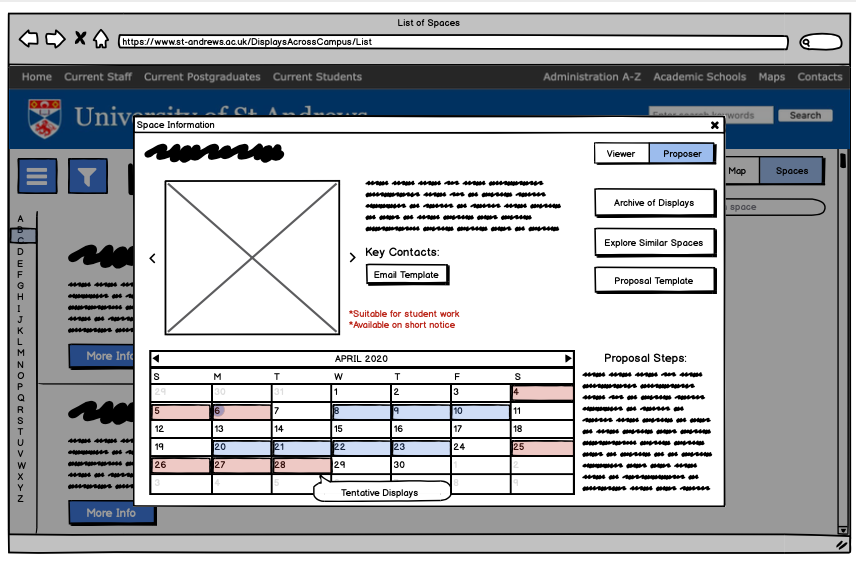
The Conservative Design
The main idea behind the conservative design is the fact that it adheres to the university’s Digital Pattern Library while still presenting a layout that is not identical to typical university web pages. The client had emphasized that this website would be created using WordPress independently from the rest of the university website and so could afford more flexibility in terms of layouts and interactivity, so it was important to use this opportunity to extend past the normal layouts and interaction modes offered by the university website and be more creative while still conforming to some factors.
The design capitalizes on one of the strengths identified in the SWOT analysis which is the fact that people are familiar with websites, while also tackling the threat identified that older people might have difficulties with more progressive designs. The design emphasizes clarity of intention, comprehensibility, and efficiency and uses typical elements such as the hamburger menu, familiar icons, input techniques for filters, etc.
A space-filling layout is used with an emphasis on images to draw users in and attract their eye. The color scheme uses the shades of blue, red, and grey specified in the Digital Pattern Library and the specified San-Serif font is used as well. Each screen was carefully designed to reduce the number of clicks/steps a user performs to get a task done, without presenting too much at the same time so that users do not feel overwhelmed. The system is also responsive by nature, with almost all interactions having immediate visible results (e.g. filtering).
The Conservative Design’s stylesheet
Following is a breakdown of four of the design’s pages where major changes were made alongside the requirements it fulfills, the interactions that can be performed on it, and its place in the overall sitemap to maintain an overview of the entire website.
The Black & White Design
The objective of this design is to capitalize on the opportunity discovered that teasers and other similar tactics can be used to engage users and provoke them to explore. The idea was to revive people’s curiosity and interest in the displays and display spaces across campus and to embed this idea of actively seeking them out. To achieve this, the design mostly shows only teasers and always leaves out a piece of the puzzle which the user has to then interact with the system to find out. To evoke a sense of mystery, a black and white theme is used throughout the website, except for display graphics and pictures. A bold font was used to create some suspense and have users feeling like they are part of a mysterious environment. Below only the fundamentally different pages are explained while other pages look the same as in the conservative design (with only a difference in colors and fonts) and so are not included in the report for conciseness but can be viewed in the interactive prototype.
The stylesheet for the Black & White Design
The page breakdown for this design is for the pages that look significantly different to the Conservative Design. Following, the rest of the pages which are very similar to the conservative design are shown as smaller screenshots.
The Museum Design
For the second innovative design, the focus was also on increasing user engagement and curiosity. Many people think of St Andrews as a museum or gallery in itself because of the different museums and spaces scattered across it, as well as the picturesque buildings, churches, and streets. Pushing this idea further, this design displays the website as if it were a gallery or display space, with the displays advertised acting as exhibitions inside of it. Elements such as paneled walls, golden photo frames, and signage navigation arrows are used to make users feel as if they are looking at a museum through their screen. Initially, a color scheme of turquoise and gold was chosen alongside certain fonts to give the website an art deco feel, but this was later changed to the same color scheme and fonts as the conservative design (used by the university). This change was based on the client’s feedback and the rationale was to visually tie the website back to the university website, strengthening the metaphor that the town/university is a museum. Again, as mentioned above, only the fundamentally different pages are highlighted in the report, with the rest being explorable in the interactive prototype.
While the three designs have the same structure and pages, they differ greatly in their aesthetics and approaches. Resultingly, each design has its own advantages and disadvantages, as well as strengths and weaknesses over the other designs. Having discussions with different stakeholders also helped illuminate these further. This comparison shows that there is no one best design, but with the advantages and disadvantages of each one identified, the most suitable design can be chosen based on the most useful advantages and tolerable disadvantages according to the context and use cases.
Value Added
From the initial survey conducted during the contextual analysis, 34/66 respondents said that they found out about exhibitions through electronic notifications like emails, and 27/66 said they found out through posters and advertising on campus. This indicates that the website will be extremely effective since it would be a combination of an electronic platform (benefiting from portability, personalization, and accessibility) as well as being a place to show posters and display graphics in general. It would also mean that instead of running into posters by chance, viewers would know exactly where to look for them and can subscribe to get notifications about interesting displays. During the sketching phase, several scenario sketches were created to highlight existing problems that each kind of stakeholder faces, and how the system can solve them (Figure 4) clearly showing the value that the proposed system will bring to each type of user. Finally, when shown to the different management teams who were initially interviewed, there was a unanimous agreement that the system was designed in a way that would address the issues raised and would improve both the quality and the efficiency of the existing processes.
Overall, the website has streamlined the lack of efficiency, standardization, and clarity in the existing workflow by acting as a central platform for all the information regarding displays and display spaces across campus. Instead of having difficulties in getting information or finding out by coincidence, viewers will now have a specific place to check or be notified about various exhibitions and events. Instead of wasting time and effort on emails going back and forth and talking to the wrong individuals, proposers will now be able to contact the right staff, having all the information and knowledge they need in advance to cut straight to the fruitful conversations that management value having. Instead of feeling lost and taking long amounts of time to coordinate across spaces, management can now quickly get an overview of their space as well as other spaces and manage all their resources in one place. All the relevant stakeholders will have an easier time because of the proposed system which has been carefully designed to satisfy the goals it set out accomplish.
Finally, below are some scenario sketches outlining problems for viewers , proposers, and management and how the proposed system addresses and solves them.
This project looked at using D3.js to visualize people’s happy moments. This was done using a dataset called HappyDB. It is a compilation of 100,000 happy moments crowd-sourced from different people. It was put together by Megagon Labs, who have made it publicly available and are using it to test how the reasons behind people’s happiness can be extracted from text inputs to then offer suggestions and make people even happier. The happy moments were collected using Mechanical Turk (MTurk) by asking people to reflect on the past day, week, or month and then write down three happy events that happened during that duration. Some minor data cleaning took place using a Python script, and the result was the following data dimensions:
A typical user of such a website would most likely be an ordinary person who comes across it, and so no advanced technical or information visualization expertise can be assumed. They would most likely want to casually explore the data due to its human, personal nature with no initial target or location in mind.
The users are given the open-ended question of the visualization “What Makes People Happy?” as the title of the opening page to subtly direct them towards exploring it. While each visualization attempts to answer this question, each one focuses on a specific aspect.
Some of the sub-questions addressed by the visualizations are as follows:
Which category of happy moments makes more people happy?
How do people’s demographics affect the number of happy moments they remember/mention per category?
a) What is their age’s effect?
b) What is their gender’s effect?
c) What is their country’s effect?
d) What is their marital status’ effect?
e) What is their parenthood’s effect?
3. Does having a longer reflection period affect the number of happy moments people remember/mention?
The Design
The website consists of three pages. The first page provides a title and introduction for the website. The page uses a visual metaphor of a sun, since sunniness is commonly synonymous with happiness. Each category is displayed at a certain position and angle to look like sun rays around the sun. Each time the user hovers over a category, a different random happy moment from that category will be displayed in the sun. When clicking a category, the website will redirect to the visualizations page (page 2). The user can also click on the “see overview” button to go directly to the overview page (page 3). This button was added since users might want to get an overview first before diving into one category at a time.
Overall, the opening page begins to address the overarching question, the overview page addresses question one, the visualizations page addresses question two, and the reflection period filter addresses question three. While the opening page and overview page are more supplementary and serve the discovery and enjoyment analysis tasks, the visualizations page also supports the three more specific mentioned tasks.
The first page’s interaction technique and visual aesthetic aim to engage users’ curiosity and encourage them to play around with the rays to see different moments, setting the scene for the exploratory nature of the rest of the pages. It also highlights the individualistic and personal nature of the data. While the other pages show numbers and marks, this page reminds users that each mark is a human being and each number quantifies happy and important moments in someone’s life.
The second page is organized in a similar fashion throughout the categories and only differs for the underlying data of the selected category. All the charts on the page are filterable by the reflection period and change dynamically based on the category selected from the side menu. The page displays a main scatterplot chart which shows age vs. number of happy moments, and an accompanying area chart beneath it which presents the same data and can be used to brush the scatterplot. The right hand side consists of three supplementary charts constituting the detailed view of the data: a bar chart showing country vs. number of happy moments, a donut chart showing gender vs. number of happy moments, and a stacked bar chart showing martial status & parenthood vs. number of happy moments. All the charts have interactive tooltips that show the number of happy moments for the selected element using numbers. The page also has a side menu to go back to the opening page, view a different category, or go to the third and final page.
The final page shows an overview bar chart of category vs number of happy moments. The bars are displayed as dashed lines with smiley faces on top to look more interesting and fit the theme. Hovering over a bar displays a tooltip showing the number of happy moments and clicking on a bar would redirect to the category’s individual deep dive page. Lastly, credits and references are provided at the bottom of the website.
Below are some of my initial hand-drawn sketches and Tableau data explorations:
The Technical Stuff
Each page on the website has its own HTML and corresponding JavaScript file. Additionally, each chart is implemented in a separate JavaScript file to support modularity and object orientation. No external JavaScript libraries were used except for D3, and Bootstrap was used to create a grid based layout.
The opening page reads the underlying data and filters each moment based on its category to be able to display a random quote within the sun (using a random number generator). The categories are added to the SVG as text items which have mouse enter, mouse out, and mouse down events.
The visualizations page reads the chosen category from the URL (which is modified based on the selection from the opening page, or overview page) or changes categories dynamically when a new one is selected from the menu. It then uses that to filter the moments by category and creates all the charts. It also dynamically updates the title based on the chosen category and updates the charts when the reflection period filter’s value changes. Finally, it also handles the brushing logic.
Each visualization file starts by filtering the data as needed. This mainly consists of counting the relevant data points since all the charts show counts. Based on the current reflection period filter, the appropriate data structure is selected and read. The axes are created and formatted and then the marks and their interactive events are created in a separate function. Finally, each chart has an update function which updates the chart dynamically when the filter value is changed.
Finally, the overview page counts the moments in each category without any filters applied and simply creates the bar chart and its interaction features while adding the aesthetics to the bars.
Insights Gained
Directly from the overview chart, it can be identified that “achievement” and “affection” are the categories resulting in the most happy moments, and “nature” and “exercise” contribute the least. By exploring the opening page, it can also be acknowledged that the moments in “achievement” revolve around work and personal accomplishments, and in “affection” around family and friends. Furthermore, going into the individual categories pages, viewers can discover that most moments for both are contributed by 25-30 year olds while more females mentioned affectionate moments over ones involving achievement (and vice versa for men). Similarly, more people in India mentioned moments including affection over achievement. While single people contributed the most moments in both categories, more people who weren’t parents mentioned moments revolving around affection which was surprising.
The visualizations presented, while together giving a holistic overview, are quite simple individually, with the most complex one covering only three attributes. More sophisticated visualizations could have been designed (or the existing ones combined somehow), but this was actively decided against to fit the target audience, who may not be used to seeing more complex or dense visualizations and also due to time considerations.
The tooltips, while informative, have subtle effects which do not give an extensive sense of interactiveness. It would have been more engaging to have hovered items highlighted across the charts, however this was not possible due to the way the data was structured and the fact that all the charts show counts which are calculated manually. Brushing as well would have been more interactive if it worked on all the views, however this was attempted and proved problematic as the counts would have to be constantly recalculated, slowing the website down to a point where it negatively affected the user experience. Finally, the reflection period and category filters only cause small – and in some cases almost unnoticeable – changes, however this is hard to address since the issue is dependent on the data itself, perhaps performing a transformation on the data could have amplified these differences.
In terms of appearance/design, the website works on both Chrome and Firefox but is not responsive to screen size, only working properly on the lab computers’ dimensions (please refer to screenshots for the intended views). Additionally, the color yellow is used throughout the visualizations for aesthetic purposes, however it could be confused with the “parents” bars in the stacked bar chart, slightly violating the effectiveness principle.
This project took a more personal note and aimed to look at my Carbon emissions in an attempt to become more environmentally friendly. I ended up developing two alternative visualizations which both convey the same information.
1. The Segmented Pie Chart
I did some research into other factors contributing to our carbon footprints not mentioned in the WWF survey. I found that books, pharmaceuticals, dairy consumption, and water usage were large sources. I also found that the average person in the UK has an extra 1.1 tonnes of CO2 emissions for health, social, and school services.
I chose dairy consumption and water usage to go on and do the second extension, which was to track my daily habits regarding these for a week. Inspired by the Dear Data project, I created two visualizations to monitor them.
After collecting this extra data, I recalculated all of my numbers based on the following reasoning:
1 glass of milk (200 ml) = 0.6 kg of CO2 emissions
Butter is 80% milk and 1 cup of milk makes around 28 g of cheese (my own knowledge)
1 liter of water used = 0.298g of CO2 emissions
On average, taking a shower uses 50 liters of water, washing machines use 55 litters, dishwashers use 15 liters, and flushing the toilet uses 10 liters of water
The average person uses about 50 liters of water to wash dishes by hand and 0.3 liters of water every time they wash their hand or brush their teeth
The visualization shows the CO2 emissions of different sources as grayscale concentric circles, meant to visually represent an eye (as a metaphor for peeking into the details of my footprint). The use of grayscale is problematic, violating the principle of expressiveness by encoding an order while it represents the sources of emission, which are nominal. I believe the effect of the violation is minimized as it is used with the circle areas which represent an ordinal attribute (amount of emission), somehow justifying the violation for the sake of the metaphor. It would have made more sense to make the biggest circle black (for the “worst” footprint), but that would have ruined the eye metaphor.
The categories contributing to my carbon footprint are shown expressively using color hues. Their contributions are clear through the use of disconnected pie chart segments. They efficiently communicate the message in terms of pop-out, grouping, and discriminability (only five hues). Using lengths as a visual attribute would have improved accuracy but was sacrificed to improve aesthetics.
Detailed information is encoded about my weekly overviews for dairy consumption (within food) and water usage (within home). For the travel section, my answers to the survey questions are compared with the class in terms of who was more environmentally friendly, and to what extent my answers aligned with the class’. For the three detailed views, vertical and horizontal positions are used for the nominal attributes. The encoding of the information within each “grid” is expressive, relying mainly on spacial region with size (repetition), shape or texture.
The visualization gives an overview of my footprint and how that fits in with others’. It’s easy to assess by glancing at the visualization, which then offers more detailed views for further analysis. It inspires action by clearly showing which section contributes most, by showing how much larger my emission is than other sources, and by going into more details about exactly what’s going on within different segments. For example, if I want to reduce my emissions, I can directly see I need to reduce or substitute milk, wash dishes and shower more quickly, and use planes and cars less.
Below you can see a summary of the information portrayed and how it was represented:
The visualization looks inviting and can make viewers curious. It encompasses all the needed information into one visualization clearly and in an aesthetically pleasing way. It can offer both an overview and an in-depth view, depending on what is needed. It makes use of several different visual channels concurrently, with proper separability, mostly in an expressive and appropriately efficient way for each attribute.
It has a few disadvantages as touched upon in the previous section. The gray- scaling might benefit from being reversed, having black for the biggest circle (most extreme), to increase intuitiveness & expressiveness. The breaking down of some segments to show further information could somehow interfere with the subconscious ability to compare their sizes, however, not significantly. There is a decreased expressiveness as well in the fact that the diameters of the concentric circles somehow clash with the thicknesses of the resulting concentric bands, possibly confusing viewers as to which is meant to represent the amount of CO2 emissions (eg. UK might be interpreted as the smallest since it has the thinnest band). Finally, it might not be clear that the pie chart segments are creating a broken up circle whose diameter is my emission (perhaps a dotted line could be drawn around their circumference to close the circle and show this).
It should be noted that icons were added to increase efficiency for spacial region encodings within the grids, and make information available at a glance in a visually interesting way. Textual labels could have been used for more clarity, but would have looked less interesting. Removing both could declutter the visualization and make it more abstract, but then it will very heavily depend on the legend.
Compared to the WWF visualizations, this looks more interesting and active. It combines all the information into one visual instead of using two separate ones. It takes into account more factors (dairy, water, service sector, pharmaceuticals, and books) and shows much more information on average weekly habits. Overall, this visualization makes it much easier to identify problem areas and actions to be taken to reduce one’s carbon footprint.
The exercise was really beneficial. Going through the process of brainstorming, sketching, and evolving my ideas highlighted ambiguities I had about theoretical aspects (eg. what my attributes were). An accomplishment for me was transitioning from making something that just looked nice, to being able to understand why and how it works.
The Star
I also created an alternative, more abstract visualization. I ultimately chose the other one because there were several problems with this one. Firstly, due to the absence of a straight line down the center of each “point”, and their different angles, it’s hard to accurately perceive the difference in size between the points of the “star.” One cannot interpret the breakdown of the travel sector questions and the weekly dairy consumption and water usage sections without resorting to the legend, however this is the case in the other visualization as well. The “stuff” and “service” sections look very empty in comparison to the other sections, and the circles in the middle feel empty as well, because of the lack of color (since it is used for other purposes). Color is also used twice, once as a fill and once as an outline, which could be confusing. Finally, the icons used in the central concentric circles are not very clear and the colors used in the “food” section need more contrast, but that is simply bad execution on my part.
It must be mentioned that this visualization has some advantages over the chosen one. It provides two levels of information regarding dairy consumption and water usage, leaning on the visuals used to record each one. It offers a breakdown in terms of the source of dairy or water usage (as the other one does), but also in terms of the seven days during which the information was collected. It is generally less crowded, and the section for travel questions is done in a cleaner, perhaps more intuitive way.
Below you can see a summary of the information portrayed and how it was represented:


 Malak Sadek